This is an edition of the newsletter Box + Papers, Cam Wolf’s weekly deep dive into the world of watches. Sign up here.
Creating a new type set from scratch is a bit like doing a jigsaw puzzle: As you progress through the difficult early stages, the entire image begins to come into focus and everything gets simpler. A designer might start with an O, for instance, because its shape will inform the curves on the C and D. Once you have E, the F and L are a piece of cake. It’s all fun and games, of course, until you get to that one dastardly, serpentine S.
“It’s the letter that you’re never satisfied with because it’s just all curves,” said Samuel Baker, the typographer who writes the “Watching Type” newsletter, which dives deep on the typography featured on timepieces.
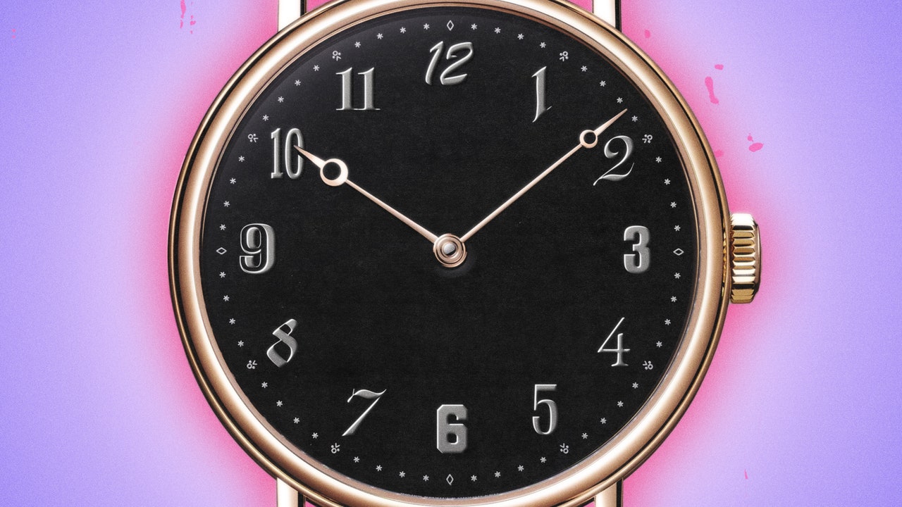
Nailing the lettering is especially important when it comes to watch design. You might have noticed that watches—even Sylvester Stallone–size ones—are quite small objects. The smallness of a watch is part of its magic. It rules that we can shrink this machinery down small enough that you can wear a whirring, pulsating device around on your wrist all day. But it heightens the importance of every detail that goes into the making of a timepiece. It’s why collectors obsess over the smallest details: Mercedes hands, twisted lugs, dots over 90. Typographical flourishes inspire their own fervor, from the “Big Red” Daytona, “Long E,” and date wheels with an “Open 6/9.”
Despite the importance of the text that appears on the dial, many experts agree that it now feels like an afterthought for several of the major Swiss brands. “I went to art school and studied graphic design, so when I started getting more interested in watches later in life, I couldn’t believe what I was seeing,” Baker said. “Watches are all about attention to detail, and then a brand will write ‘Tourbillon’ on the dial in Arial. You kind of can’t square those things.” You might call this Baker’s “Papyrus” moment. “How has a Swiss watchmaker chosen to use this Microsoft Word font?”
Baker’s indignation actually led him to a role designing type for the upstart watch brand VPC. After he left a snarky comment under an article previewing the brand’s logo, the founder took the criticism to heart and enlisted Baker to work on improving VPC’s visual language. Since then, Baker has worked with a handful of other young makers and launched his newsletter on watch type.
What I found in my conversation with Baker is that this work isn’t just about designing the prettiest letters one can. Because of the size of watch dials, the shape of letters are often informed by what’s technically possible. The reason the Audemars Piguet logo is so elegant on old Royal Oaks is because the letters are designed in part to not fill a letter’s blank spaces.