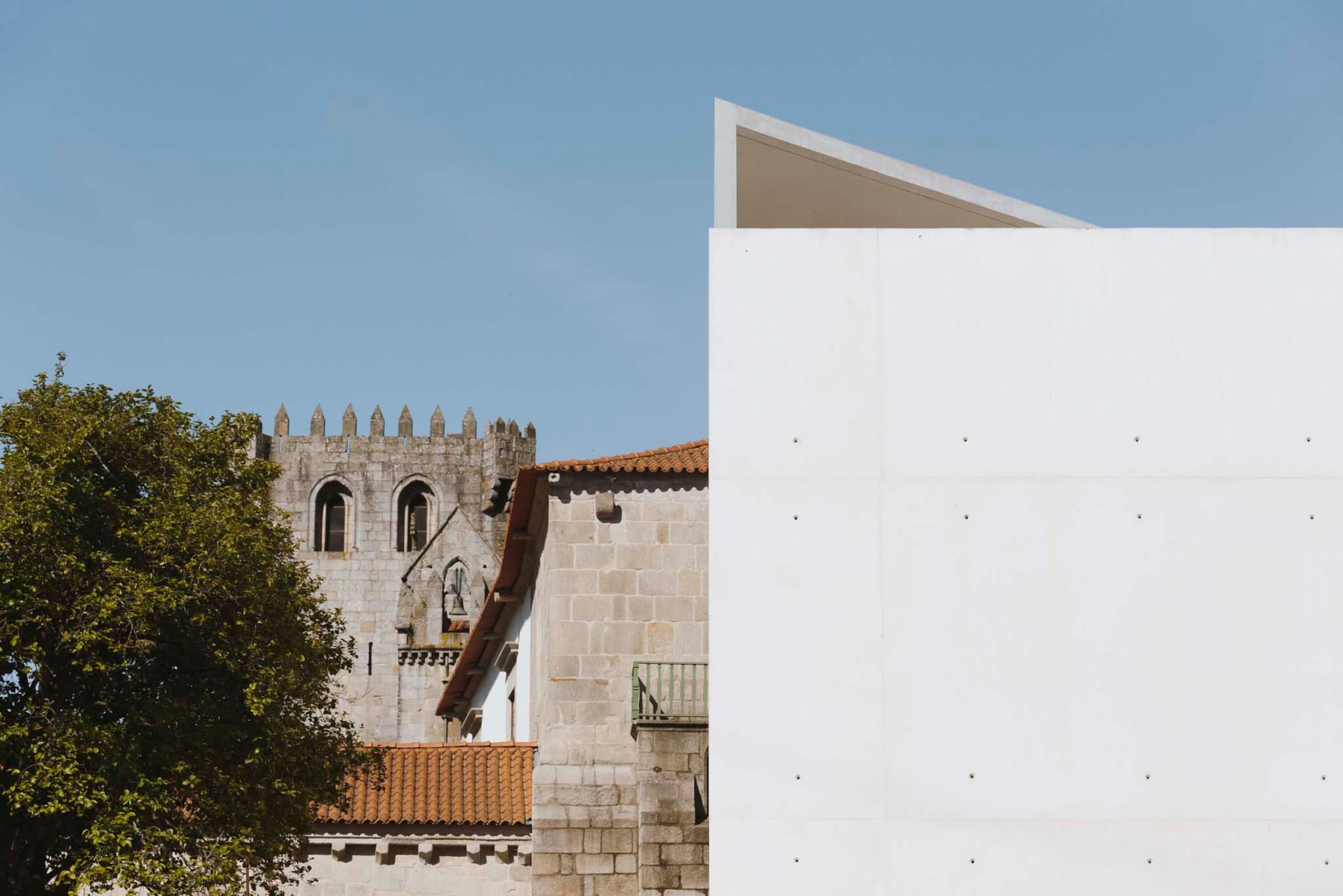
Situated at the edge of two cities, the Monastery of Leça do Balio site has a distinctly calming feel, separate yet near the bustle of Porto and Matosinhos. The complex is believed to have existed here in some form since the 10th century, offering spaces for communal worship and rest for those navigating the Camino de Santiago. Now the two forms—the monastery and its church—sit nestled together with a new, third companion: a crystalline, bone-white concrete shell.
The site has been revitalized and recontextualized for new audiences and 21st-century cultural programming by Álvaro Siza, whose sensuous, minimally invasive work is a fitting choice for Leça do Balio. The historic monastery was designated a national monument in 1910, but its program has continued to change with the times. The Livraria Lello Foundation, an institution devoted to promoting critical thinking and celebrating the arts across Portugal, purchased the monastery in 2016. Its aim was to establish a base for artistic and research-led exhibitions, redefine the monastery’s relationship with the surrounding grounds, and kick-start a cultural path of art routed from Porto Cathedral to Santiago de Compostela Cathedral in Spain.
Álvaro Siza was commissioned shortly after the site’s purchase, given his portfolio of cultural schemes and interest in painting and sculpture. The church is untouched, while the monastery and grain silo have been restored. Siza’s interventions in the monastery are restrained—new timber linings were installed overhead and underfoot, plasterboard partitions were removed, and original stonework is once again revealed. But each of these moves, while elegant and modern, reveals to visitors traces of change of use, extension, and repair. Siza’s hand is evident in the interior design and objects held in each space, too. His studio installed furnishings throughout and notably created a series of new exhibition spaces in the medieval complex.
Stepping outside the monastery’s cloister, to the southern edge of the site, guests find a newly laid square that orients one toward a winding path—which leads onto the other two pieces of architecture on-site. The first of these is the restored silo, now hosting a Siza-designed fountain. Entering the horseshoe enclosure feels akin to being within a granite sepulcher punctured only by a small, high-level window and oculus. Continuing on the processionary route eventually brings you to a final structure: Siza’s new site-specific landmark. The shell-like pavilion hosts the architect’s new work of sculpture, titled Wayfarer.

Standing at the point of entry to Siza’s pavilion, one can see similarities to the entryway of the Romanesque church. Concrete planes come together to form an opening that is oversized, like a medieval portico—albeit without ornamentation or delicate carving.
As you cross the marble threshold into the open sculpture, there is a sense of entering a sacred void. Beyond, an open-air space is guarded by a the “wayfarer,” a marble statue standing attentively. On-axis with the entrance to the pavilion, large timber doors on pivot hinges reveal a rectangle of darkness that draws viewers forward to an open cube form.

In the secondary space there is darkness. The eyes are forced to adjust, finding a dappled field mediated by three qualities of light: softened at clerestory level, delicate pinpricks through plug holes in the concrete shuttering, and finally sharp light pouring in from a triangular opening overhead. This inner sanctum has an L-shaped plan, completely free of obstruction, so one is free to wander and perambulate. The pin-sized holes in the walls not only introduce delicate light but also subdivide the space, creating a loose grid. Professor of Portuguese literature Pedro Eiras, who was invited by the foundation to reflect on the sculpture, notes the shifting nature of the solid walls: “If you move your eyes, the surface is sewn together, suddenly opaque, but if you move again, light is turned on, and then off again.”

The spatial treatment of the interior and exterior spaces combined with the movable furniture gives the pavilion an ambiguous quality. It is not a secular temple, and it does not demand any particular mode of inhabitation. Instead, the pavilion simply offers a waymark of rest for travelers, whatever guise “rest” may take. Responding to the Livraria Lello Foundation’s brief, the new space is decidedly contemporary while creating a responsive extension to the historically religious site. The expansive vision for the landscape also includes a planted “Eden,” currently in development, that will bleed into the surroundings and add more opportunities for questioning.
The pavilion oscillates between earthly and spiritual considerations: There are no overt iconographic elements, so visitors can reflect in a looser framework. Rather than demanding consumption, production, or even action, it is an architecture designed for periodic introspection and meditation.
Josh Fenton is an architectural writer and communications consultant based in London.

